through travel
Established leadership in travel, fair home based opportunity, 70+ years of travel experience, extensive training and support, the evolution of travel.
Supported by an established leader in the travel industry, Evolution Travel is a powerful and affordable home based travel business. Our program has the experience and management to provide a long term program where success is derived from both travel sales and Referral Program.
Looking for more?

More than just Travel

Basketball Tickets

Boxing Tickets

NASCAR Tickets

Soccer Tickets
Start your home based travel business.
checkout our
Top Reviews
There are many variations of passages of lorem ipsum but the majority have alteration in some form, by randomised words look. Aene an commodo ligula eget dolorm sociis.

Kevin Smith

Christine Eve

Mike Hardson

Have you registered? Welcome back!
Need a travel site? Create an Account.
Tech Support: [email protected] Please include your Agent ID in the email
Copyrights © 2024 All Rights Reserved by Evolution Travel LLC. - Privacy Policy
(800) 272-4377
The owner of this website is an Independent Contractor for Archer Travel Service, Inc. and operates this business as an Independent Company with all financial responsibilities associated with it.
See The World
- client portal
Evolution Travel Group was founded by Christopher Davies, who has extensive experience in operating successful travel programs. It's namesake, Evolution , was inspired by it's mission of "doing things better" - constantly striving for superior and ethical business practices in order to provide outstanding quality, value, and personalized customer service.
What We Believe:
Travel is Worth It!
We believe that travel broadens the mind and gives each of us a different perspective on life. Get out and experience the world!
Travel Enriches One's Life
When you visit a unique destination and culture, you'll become more open to various ways of life!
We Can Help
With so many places to visit, choosing a travel destination is difficult. Talk to our staff to find out what a location has to offer.
We're the Best!
When you travel with us, you can trust that we'll take care of you. Our services guarantee you'll have an amazing vacation experience.
Copyright Evolution Travel Group . All rights reserved.

Travel Cafe
Travel Cafe – Home
Thank you for visiting the Travel Cafe! You must enter the Travel Cafe through your Evolution Travel Back Office from this point forward.
Archer Travel Service
At archer travel service, your travel dreams are our priority.
Archer Travel is a brick and mortar family owned travel agency established in 1952. In an era of impersonal and inefficient online booking forms, we understand that nothing can replace the meticulous care of a real travel agent. No matter how complex your travel itinerary is, we guarantee we can handle it.
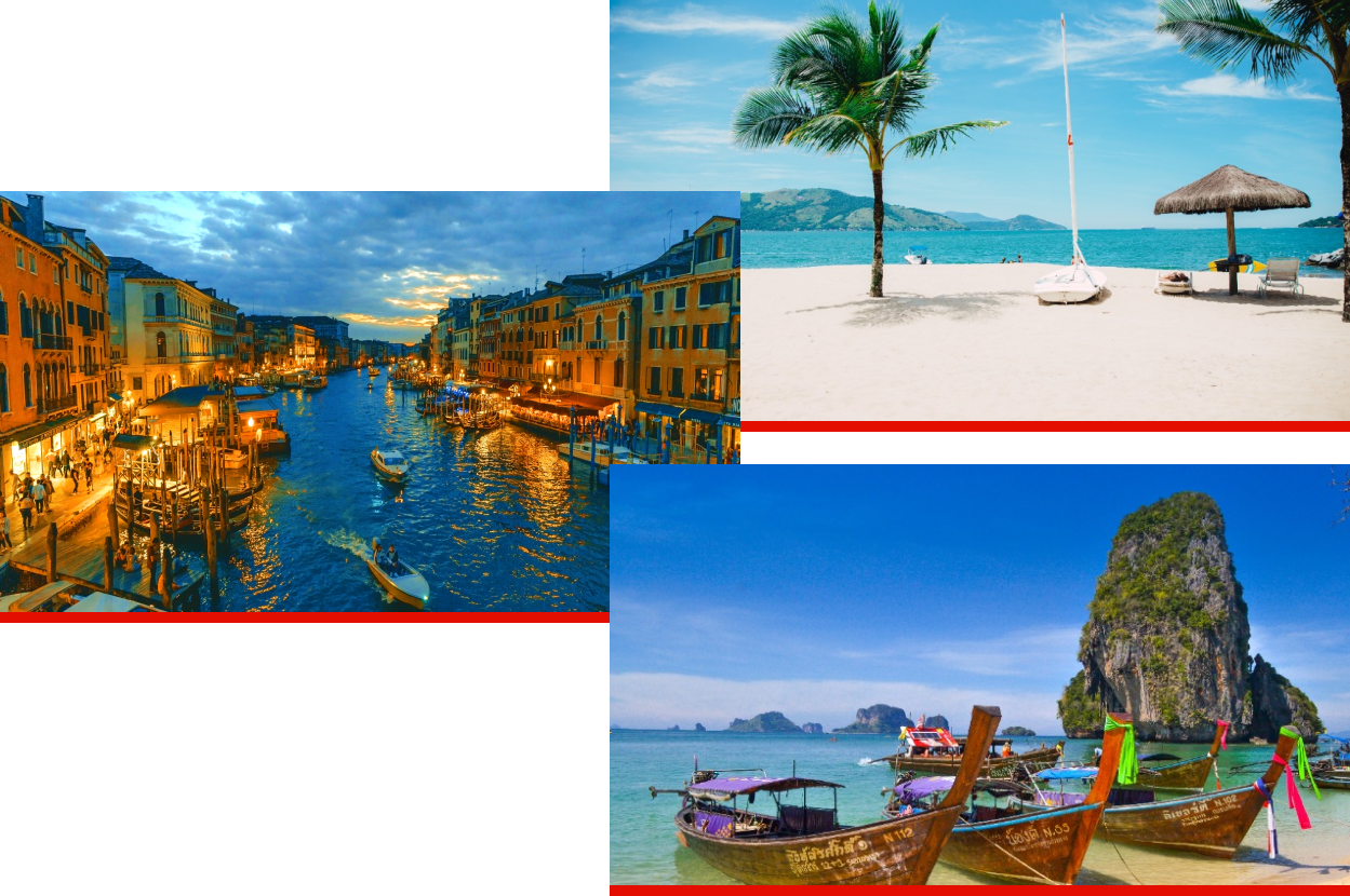
We don’t just book travel — we curate unforgettable experiences for our clients. Our large network of agents undergoes intensive training programs, ensuring they possess expert knowledge and stay updated with the latest trends in the travel industry. This enables us to provide personalized and innovative travel solutions, tailored to the unique preferences of each traveler. We take a creative approach to crafting journeys, bringing together exceptional destinations, handpicked accommodations, and immersive activities. Moreover, our dedication to exemplary customer support ensures that every step of the journey is seamless and hassle-free, allowing our clients to focus on creating lasting memories.
Our Services

Vacation Travel
Travel with family, friends, or solo to your dream destinations.
Group Travel
Got a large group? No problem, we can handle groups of any size.

Corporate Travel
We can book any kind of travel for your corporation.

Sports Travel
We can focus on your team’s booking so you can focus on winning.
WHAT PEOPLE ARE SAYING
Archer Rivas Foundation
Terms & Conditions
Privacy Policy
Cancellation & Refund Policy
Archer Travel Service, Inc. 2941 Foothill Blvd. La Crescenta, CA 91214
Seller of travel: CA #2001330-10, FL #35395, HI #TAR-6612, WA #603352551 Copyright © 2023. All Rights Reserved Archer Travel Service, Inc.
Los Angeles 2941 Foothill Blvd. La Crescenta, CA 91214
Sydney, Australia Level 5, 49 York Street, Sydney, Australia
Las Vegas 10120 South Eastern Avenue Henderson, NV 89052
Coming Soon: Mexico City Europe
Mexico City, Mexico Ave Paseo de la Reforma 296, Juarez, Cauhtemoc, CDMX 06600, Mexico
Coming Soon: Europe

Terms & Conditions | Privacy Policy | Cancellation & Refund Policy
(818)248-1511
Seller of travel: CA #2001330-10, FL #35395, HI #TAR-6612, WA #603352551
Wanderlust Approved: Top 10 Travel Logos You’ll Want to Follow
Stuart Crawford
Wanderlust Approved: Top 10 Travel Logos You'll Want to Follow
For those bitten by the travel bug, the mere thought of faraway destinations can make our hearts beat faster. Whether it's the anticipation of new experiences or the prospect of getting away from it all, travel uniquely fills us with excitement and wonder. But before we even set foot on a plane or embark on a road trip, we often look to social media and travel websites for inspiration. And what better way to capture our attention than with a stunning logo? This article has compiled a list of the ten best travel logos to awaken your wanderlust and inspire you to embark on your next adventure.
Top 10 Travel Logos
1 – airbnb.

Airbnb's innovative approach to transforming traditional accommodation and integrating it into the sharing economy is the cornerstone of the company's remarkable success. However, one factor that has contributed to the company's success is its logo .
Building brand awareness is crucial to the success of any business, especially in a new industry. Airbnb achieved this by raising its profile through aggressive digital marketing . The Airbnb logo played a crucial role in digital marketing efforts.
The Airbnb logo has caught people's attention in various ways. Some even believe that the emblem has hidden meanings. However, before we examine the hidden meanings, let's first look at their superficial meaning.
The Airbnb logo is a distinctive and intriguing design with various symbols. The teardrop shape in the centre of the logo represents the head of a human being and emphasises that Airbnb is a brand that focuses on people. The place symbol is also associated with travel because that is what Airbnb is about.
Besides its superficial meaning, the Airbnb logo has also been subject to various interpretations and theories. Some believe that the design of the logo is meant to convey a sense of belonging and community. Others believe that the logo's design evokes feelings of adventure and exploration.
One popular interpretation is that the Airbnb logo is based on the Hindu symbol “Aum”. Aum is a sacred sound and a spiritual symbol in Hinduism, Buddhism and Jainism. The design of the Airbnb logo conveys a sense of calm and relaxation, similar to meditation.
Regardless of the different interpretations, the Airbnb logo has become an iconic symbol for the sharing economy and a brand for community, adventure and travel. It is a testament to the power of branding and the importance of creating a strong visual identity for a business.
2 – Expedia Travel
Expedia is a well-known online platform that caters to the needs of travellers worldwide, offering them a wide range of flights and accommodations. Founded in 2001 in the United States, the company has become one of the most popular online agencies in the world, serving millions of travellers every year.
One of the main aspects of Expedia's success lies in its consistent visual identity, which has remained unchanged since its inception. The company's logo, a modified version of the original design, has become synonymous with the brand and is instantly recognisable worldwide.
The Expedia logo is simple and elegant, featuring a stylised globe with an aircraft in orbit. The “Expedia” typography is clean and modern, conveying a sense of efficiency and professionalism. Blue and white underline the brand's message: reliability, trustworthiness and security.
Over the years, the Expedia logo has undergone only minor changes, such as typography and colour palette adjustments, to keep it fresh and current while maintaining its distinctive identity. However, the core design elements have remained unchanged, making it instantly recognisable to travellers worldwide.
The success of Expedia's visual identity can be attributed to the fact that it effectively communicates the company's message and values to its target audience. The clear and modern design of the logo , in combination with the blue and white colour scheme, underlines the brand's message: reliability, trustworthiness and security.

3 – Lonely Planet
Lonely Planet is a world-renowned travel publisher operating since its founding in Australia in 1972. Over the years, the company has expanded its offering to include printed books, mobile apps, and video materials used by travellers worldwide.
In 2022, the company underwent a significant rebranding, including redesigning its visual identity. The new logo features a brighter blue and white colour palette, giving the brand a modern and fresh look. The layout of the Lonely Planet lettering has also been changed, with the graphic element being a globe with blue continents on a white background between the two parts of the lettering. This new layout reinforces the brand's message of global discovery and adventure.
The font for the logo's lettering has also been refined: the bars between the letters have been thinned, and the letters have been given more air. This updated font conveys a sense of openness and accessibility that aligns with the brand's inclusivity values and welcomes all travellers.
The rebranding of Lonely Planet aimed to modernise the brand while maintaining its core values of providing travellers with the best possible resources and tools to explore the world. The updated visual identity has successfully achieved this goal, giving the brand a more contemporary look while maintaining its recognisable and trusted brand image.
4 – Holiday Inn

Holiday Inn, a subsidiary of the InterContinental Hotels Group, is a leading global hotel chain with over 2,600 hotels worldwide. Headquartered in Atlanta, Georgia, the company has become a household name for travellers seeking comfortable and reliable accommodation.
One of the most striking features of Holiday Inn's visual identity is the bright and intense colour palette based on green. This colour choice represents comfort, success and growth, the most important values the brand wants to offer its guests. The green colour is used in all areas of the brand, including the logo, marketing materials and hotel décor.
Despite the consistent colour palette, the Holiday Inn logo has undergone several redesigns over the years, with five significant changes to the visual identity. Each redesign aimed to keep the brand fresh and relevant while maintaining the core values and identity.
The original Holiday Inn logo had a simple design with a house with a curved roof and a sign saying “Holiday Inn” in front of it. The logo has been revised several times, with changes to the typography, colour scheme and design elements.
The current Holiday Inn logo features a modern and sleek design , with the word “Holiday” in bold letters and “Inn” in a smaller font below. The logo includes a stylised “H” in green, which adds a unique and recognisable element to the design.
5 – TUI
TUI, short for Touristik Union International, is a global travel and tourism company founded in Germany in 1923. Since then, the company has expanded its operations worldwide, offering millions of customers a wide range of travel services annually.
One of the most recognisable aspects of TUI's brand identity is its logo, representing the company's motto, “Discover Your Smile. The logo features the words “World of TUI” in bold red lettering with a stylised symbol of a smiling face directly above the lettering.
The TUI logo was designed by the renowned design agency Interbrand, aiming to create a simple yet meaningful design that captures the brand's essence. The smiling face symbol in the TUI logo is a visual representation of the company's commitment to providing customers with the best travel experiences and creating happy moments that bring smiles to people's faces.
The colour palette of the TUI logo is based on a simple and effective combination of red and white, with bright red representing passion, energy and enthusiasm. Using red on a white background creates a bold, eye-catching design that is easily recognisable and helps establish the brand's identity across different marketing channels.
6 – Trivago
Trivago is an online travel service specialising in providing travellers with a comprehensive metasearch experience. The company was founded in Germany in 2005 and has grown into a global brand represented in over 190 countries. Today, Trivago is owned by Expedia, one of the world's leading travel agencies.
Trivago's visual identity is known for its simplicity and minimalism. The brand's logo is text-based, with the company name written in a clear and modern font. The logo is usually in three bright colours: Blue, Orange and Magenta. This colour palette conveys a sense of energy, vibrancy and excitement and reflects the company's focus on helping travellers find the best possible deals for their trips.
Trivago's visual identity may be simple, but it is also very effective. The clean, uncluttered design of the logo makes it easily recognisable and memorable, while the bold, bright colours grab attention and create a sense of urgency. This is especially important in the competitive online travel market, where customers are bombarded with many options and offers.
Trivago's visual identity is reflected in its logo and the design of its website and mobile app. The company's website features a clean, minimalist layout that is easy to navigate. At the same time, the mobile app is designed to be simple and user-friendly, allowing customers to search for and book their travel accommodations quickly and easily.
7 – Tripadvisor
In 2020, the famous travel company underwent a significant overhaul of its logo. The new design scrapped the previous colourful version and took a minimalist approach, adding bold black lines to the iconic owl emblem. The updated design presents a much stronger and more modern look, in keeping with the company's brand ethos of being forward-thinking and adaptable to the needs of its customers.
The new logo features the iconic owl in black, either alone or to the left of the company's lettering, which is now in capital letters. The owl is a recognisable symbol of wisdom and intelligence, which fits well with Tripadvisor's role as an information provider to travellers. The new green background adds a sense of freshness and vitality and underlines the company's focus on helping people discover new and exciting experiences.
Tripadvisor's new logo perfectly represents the company's evolution and growth in the travel industry. The redesigned emblem is elegant, sophisticated and memorable while retaining the company's iconic owl symbol. Overall, the updated logo reflects their commitment to providing customers with the best travel experience.
8 – Kayak
Kayak is a well-known online travel agency founded in the United States in 2004. Since then, the company has expanded globally, and its website is now available in more than ten international languages.
Kayak's original logo was designed in 2004 and was only slightly changed in 2017. The original concept of the logo was so successful that it did not need to be changed significantly over time. The Kayak emblem consists of a word mark with each letter in white within an orange rectangle. The original logo used a soft, rounded sans-serif font and a thin horizontal line in grey to give the impression of an airport flight tableau.
In 2017, they updated the Kayak logo with a more vigorous and sharper typeface. The wordmark is now in a bold geometric sans serif typeface with straight, clean lines and traditionally cut edges and angles. The grey line that ran through the logo has been removed, resulting in a more uncluttered and minimalist design.
The Kayak logo's bright orange colour stands out and is instantly recognisable to customers. The colour is associated with excitement, energy and warmth, which is very fitting for a company in the travel industry. The simplicity of the design and the bold colour scheme convey the company's commitment to making travel easy and accessible for everyone.
9 – Transport for London

Transport for London (TfL) is an integrated transport system in London that manages the city's public transport network, including the London Underground, buses, trams and rail services. TfL is known worldwide for its iconic and unique logo based on a roundel.
The roundel was first introduced in London Underground stations in the early 1900s to help passengers find their way around and locate their location and destination. Today it is a fundamental element of TfL's visual identity and is used across all modes of transport.
Each of TfL's transport divisions has its rondel representing its unique identity while providing a coherent and recognisable TfL brand. For example, the London Underground rondel is instantly recognisable with its red and blue colour scheme and a horizontal blue bar. In contrast, the London Overground rondel is orange and blue with a horizontal orange bar.
The roundel allows TfL to convey a sense of unity and consistency across all modes while communicating that each department has its purpose and identity. It is a testament to the power of strong visual branding and how it can help build trust and recognition across a diverse and complex transport network.
10 – Booking.com

Booking.com is a renowned online travel agency belonging to Booking Holdings. Since its inception, the platform has offered various accommodation search and booking services, ranging from private budget accommodation to luxury hotels. In addition, the company provides transport and leisure options to its users so they can plan their perfect holiday.
Booking.com has a simple and minimalist visual identity, consisting only of the company name in a unique font. The brand has never had a solid background, and the colour scheme has changed slightly. The logo's simplicity is intentional as it is meant to be easily recognisable and memorable to users.
The font of the Booking.com logo is significant, with bevelled edges that tilt 23.5 degrees. This design choice represents the natural tilt of the Earth's axis, paying homage to the planet we all share. The bevelled edges of the letters give the typeface a unique and modern look, ideally in line with the company's mission to provide its customers with a unique and personalised travel experience.
Wrapping Up
In summary, the world of travel is full of opportunities for adventure and discovery, and travel brand logos serve as the first point of contact with potential customers. A well-designed logo has the power to attract and captivate, and the logos of the top 10 travel brands featured in this article have certainly achieved this goal. From the simplicity of Kayak's orange and white lettering to the boldness of TUI's smiling face, each logo tells a story and conveys a unique brand identity.
As well as being eye-catching, these travel logos symbolise the brand's values and mission, reminding us of the beauty and excitement that awaits us on our travels. Whether you are a seasoned traveller or a dreamer, let these travel logos inspire you to explore the world and create unforgettable travel experiences.
Related Posts
- Graphic Design Ethics: Copycats, Clients, and Copyrights
- The 7 Different Types Of Logos & How To Use Them
- Sensory Branding: Engaging All 5 Senses
- Personalisation in Marketing: Why it Matters
- Digital PR Strategies to Boost Your Online Presence
Need help Building your Brand?
Let’s talk about your logo, branding or web development project today! Get in touch for a free quote.
Leave a Comment Cancel reply
Trusted by businesses worldwide to create impactful and memorable brands.
At Inkbot Design, we understand the importance of brand identity in today's competitive marketplace. With our team of experienced designers and marketing professionals, we are dedicated to creating custom solutions that elevate your brand and leave a lasting impression on your target audience.

Archer Evolution Beginnings – Custom Video
$ 15.99 – $ 19.99
Travel Agent Name, Business Name, Phone Number, Email Address, Website, or Social Media Handles... *
Upload Logo Here (Only if selected Logo Custom Video Option)
Description
Additional information.
Need a high-quality professional video to help promote your Evolution Travel business? The Archer/Evolution Marketing folks can customize it for you, so you can upload it and send to anyone you want!

For Example: Archer Travel Service 818-248-1511 Insta: ArcherTravelService www.archertravel.com
LOGO If you purchase the personal logo added, the placement differs for each video dependent on your logo size and what the video already contains. If you upload a logo that is not high enough quality and the video needs to be redone, the time to redo the video would need to be paid for in the video corrections section. When Uploading a Logo to your order, we accept these Image File Types jpg, jpeg, png, pdf, eps, raw, tiff, gif.
GETTING YOUR VIDEO Please allow 3-10 business days for processing. (Weekdays Only)
You will see a link via WeTransfer sent to you from an @archertravel.com to the email address you entered in check-out. Further instructions will be sent via email.
Any Errors in your digital product/s made by Archer Travel will be revised and re-sent to you immediately. Any Typos by Travel Agent in order the first time will cost a $2.50 USD processing fee to re-do. And any changes after that will cost $5.00 USD. Travel Agents should always double check their spellings as its apart their business.
Related products
Let’s Cruise (Spanish) – Custom Video
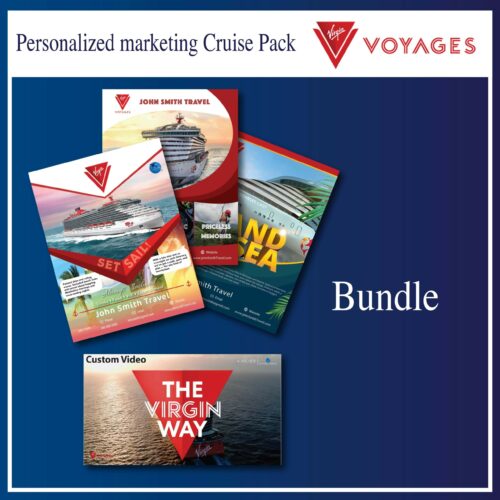
Virgin Voyages Bundle
Carnival Cruise Line (Fun) – Custom Video
Cruise vacations – custom video, quick links, stay up to date with our latest news & offers.
Seller of Travel: CA # 2001330–10, FL # 35395, HI # TAR-6612, WA # 603352551
Terms & Conditions | Privacy Policy


Thomas Cook logo evolution
Thomas Cook , Britain’s oldest tour operator, has revealed a new logo, the sunny heart, and changed it’s tagline from “Don’t just book it. Thomas Cook it.” to “Let’s go.”

Derbyshire-born Cook (1808-1892) began his travel company in 1841, 50 years before this brochure cover (below) was in use.
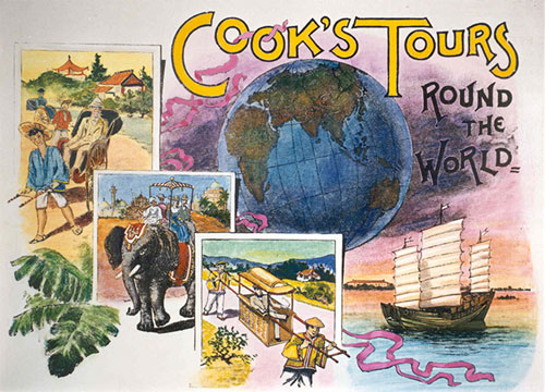
The business passed to his only son John who had been his partner since 1864.
Here’s the “Cooks Tours” logo from late in the 19th century.
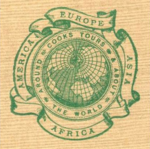
In 1914, a fifth continent was added to the surrounding ribbons (below).
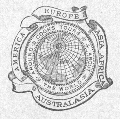
And in 1928 a fifth ribbon was added, and the brand name changed from Cooks Tours to Cook’s Travel Service.

The globe was replaced in 1930 with TC&S for Thomas Cook and Son.

These two designs were used between the mid-1930s until after the second world war.

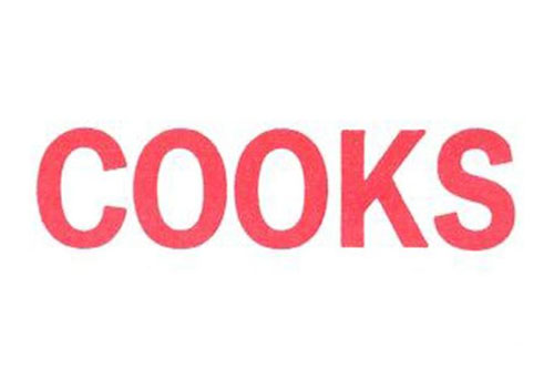
Cooks was seen between the 50s and 70s.
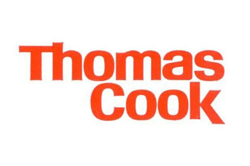
The “flame red” Thomas Cook logo was introduced in 1974.
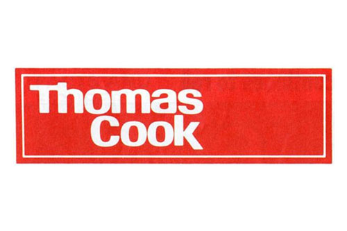
It changed again in 1989.
The “sea and sun” yellow and blue was launched in 2001.

And here’s the new look.
“After a successful year in the Nordic countries, the sunny heart is now the unifying symbol for the whole Thomas Cook Group, in more than 70 countries.”
Quoted from the Happy F&B website — the Swedish agency behind the design.
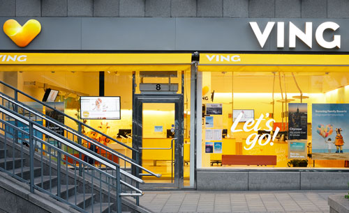
Thomas Cook marketing and ecommerce director Mike Hoban said , “The gold sunny heart logo had been created to evoke warmth and emotion and worked for all types of holiday, even skiing. […] Then, the type in metallic grey reflects a high tech, digital Thomas Cook.”
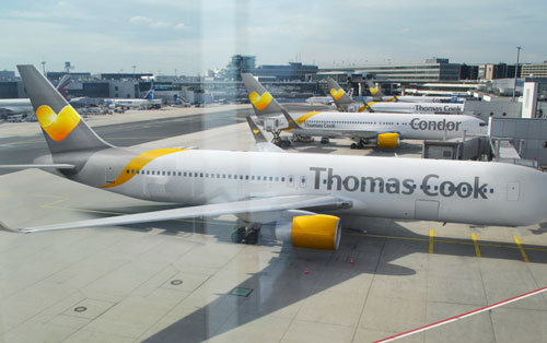
The Independent reports that this is the first time in Thomas Cook’s 172-year history that all its companies will have a unifying identity.
Elsewhere: The sunny heart brand page , on Thomas Cook Thomas Cook press release Thomas Cook unveils new logo , on The Belfast Telegraph Thomas Cook unveils Sunny Heart logo , on The Telegraph Thomas Cook history in pictures , on The Guardian (from 2011) Thomas Cook biography The logo journey of Thomas Cook (PDF)
Logos and dates courtesy of Loulla-Mae of Marketing Magazine .
# Evolution
I like the original logo. That one had some class!
Oh it’s a heart is it? Must admit I didn’t see that at first.
Maybe because, I suspect, it’s actually a ‘V’ for Ving with a heart rationale added later. I like grey and yellow as a colourscheme and I’ve used it a few times although it’ll take some time to grow on me in the context of travel agent, has a very corporate feel.
Their new logo design is nice and warm to look at. Just like it should be when you consider traveling to warm countries. I just wonder how they may have developed a logo design that seems like many others out there.
http://obieosobalu.files.wordpress.com/2011/09/excel_for_mac_2011_icon.jpg http://upload.wikimedia.org/wikipedia/en/5/54/SVT_Play.png
There’s an incredible similarity that cannot be mistaken. Yes these logos perhaps have a different color and are turned 90 degrees, but still.
I don’t get it – imho the globe is more important than this heart shape.
It’s mixed up with a hammock?
http://kayakdave.com/wp-content/uploads/2012/08/byer-hammock.jpg
I don’t like it – sorry.
I did not see the heart at all. Also it does not sit well on the tail of the plane. why all the gradients? Are they trying to show a heart or the fold or the curve? If the heart then why the fold and gradients? Not sure what is the reasoning behind it. Overall it fits better for a product in a pharmacy.
An obvious ripoff designed for Ving over Thomas Cook, maybe there was a reason the whole brand wasn’t unified under one logo. The yellow is nice but grey is the last colour that should be used by a Holiday company.
If they brought back the 1928 logo I would go with them every time I traveled.
The logo with ribbons on it was classy and I was pretty stunned how the new logo turned out. Definitely has a good feel to it.
Nice and cheerful but it looks like a pharma company logo. Still nice nonetheless.
Cheesy use of gradients and highlights… is that a lens flare? The logos appear to get successively worse in my opinion. The The 2001 “sea and sun” yellow and blue is terrible.
My word, that globe thing was truly horrible. Anything’s an improvement on that, even these little golden pills.
I’m with Rich – bring back the one from 1928. It’s lovely, speaks of the history of the company, and evokes a sense of adventure sadly missing from modern travel. I look at that and think of doffing a pith helmet and exploring exotic new places.
I look at the new one and think of bland package holidays which make reading a Dan Brown novel seem like a good idea.
It looks like a crisp to me.
The Belgium web agency madewithlove ( http://www.madewithlove.be/ ) brings an attack against Thomas Cook for “plagiarism.” They’ve had nearly the same logo for three years.
This is an example of not being afraid to completely change the logo.
Yep, sure looks like “madewithlove” has had this logo in action for quite sometime. IDENTICAL.
I used to work for Thomas Cook and definitely share some of the same sentiments of other designers on the new and previous logos. This new mark made sense for Ving but using it for TC seems completely out of context. However, as some people mentioned previously, anything is better than the globe version.
I’d also like to mention that just as the globe with its gradients and style seemingly fell out of fashion fairly quick (if it ever was in fashion), so too will be the fate of the golden gradient pill heart. Solutions=simplicity IMO.
Hadn’t had to use a Thomas Cook store since the rebrand until recently, so couldn’t find it on the High Street because it didn’t look like what I was looking for. The logo looks like a Quaver. End of.
Share a thought Cancel reply

British Airways logo evolution
Wegmans logo refresh

COMMENTS
Supported by an established leader in the travel industry, Evolution Travel is a powerful and affordable home based travel business. Our program has the experience and management to provide a long term program where success is derived from both travel sales and Referral Program.
Evolution Travel offers a full-service agency for travel incentives, meetings, events, group and leisure trips.
Evolution Travel. 15,800 likes · 21 talking about this. Evolution Travel in partnership with Archer Travel Service, Inc. We strives to be the best home base.
Evolution Travel, La Valletta (Valletta, Malta). 149,719 likes · 1,182 talking about this. Agenzia di viaggi e Tour Operator con Consulenti di viaggio...
In this tutorial, you'd be learning how to download logos in Evolution Travel.. The first step is to Open Evolution Travel back office, and Click Travel Cafe in the left side of your screen.. Click New Marketing Materials! (Media Library) in the left side of your screen.. Scroll down, and Click on the logo you want to download.. Right Click the logo, and Select Save image as to download the ...
About us Evolution Travel Group was founded by Christopher Davies, who has extensive experience in operating successful travel programs. It's namesake, Evolution, was inspired by it's mission of "doing things better" - constantly striving for superior and ethical business practices in order to provide outstanding quality, value, and personalized customer service.
15 Evolution travel Logos ranked in order of popularity and relevancy. At LogoLynx.com find thousands of logos categorized into thousands of categories.
Brand Logos. View all. Logo. PNG. Icon. JPEG. About. Description. Evolution Travel is a renowned brand in the travel industry, offering a wide range of services and products to fulfill your vacation dreams. With a network of online travel consultants, they are committed to creating and organizing your next travel experience, ensuring it is ...
Archer Travel Mexico - Evolution Travel, La Crescenta-Montrose. 2,787 likes · 337 talking about this. Hosted by Archer Travel Service, Inc. (Acreditado por el BBB) Archer Travel Mexico (Viajes de Archer)
Thank you for visiting the Travel Cafe! You must enter the Travel Cafe through your Evolution Travel Back Office from this point forward.
At Archer Travel Service, your Travel Dreams are our priority Archer Travel is a brick and mortar family owned travel agency established in 1952. In an era of impersonal and inefficient online booking forms, we understand that nothing can replace the meticulous care of a real travel agent. No matter how complex your travel itinerary.
Logo evolution is common in the branding world. Let's take a look at some of the most famous logos that have changed over time.
Most famous logos evolve over time. As time marches forward, brands change. Here are 11 fascinating examples of famous brands, whose logo evolution was a key part of their brand evolution; critical to staying relevant.
Meaning and History. The logos of the online travel firm and its flagship website did not differ at first. They had a common symbol—an airplane circling the globe. That changed in 2018 when Pentagram designed Expedia Group, Inc.'s new visual identity. So, the parent company began using a blue and white emblem with a lowercase "e," while ...
Whether you need a beach logo, safari logo, cruise logo, mountain logo, or a logo for travel agency, our logo maker can generate hundreds of travel logos that you can customize according to your needs. The logo design process is highly simplified and streamlined, optimized for various platforms and formats. There is also a wide library of icons ...
Check out our top 10 best travel logos list, and get ready to add some serious wanderlust to your social media feeds. Follow the design blog!
Evolution Travel Cafe, La Crescenta-Montrose. 28,350 likes · 1,068 talking about this · 34 were here. ⭐️ One-stop resource for Travel Agents! Hosted by...
Description Archer & Evolution Beginnings - Custom Marketing Videos Watch on Need a high-quality professional video to help promote your Evolution Travel business? The Archer/Evolution Marketing folks can customize it for you, so you can upload it and send to anyone you want! IMPORTANT Please include 4 of the following full name, business name, phone number, email address, website, or social ...
Famous logos evolving over time Keep the idea of simplicity in mind as we travel through the evolution of famous logos. You'll start to recognize the pattern. Many go from descriptive logos to abstract iconography once the brand has cemented its symbol and become well-known.
While a logo is an identity, it is also a symbol that reflects the core ethics of your work. People do create their own logos, but creating a logo that catches peoples attention requires expertise. With Designhill you can explore plenty of travel logo ideas, so that you can pick the best or get an inspiration for your own logo.
Thomas Cook logo evolution Thomas Cook, Britain's oldest tour operator, has revealed a new logo, the sunny heart, and changed it's tagline from "Don't just book it. Thomas Cook it." to "Let's go." Derbyshire-born Cook (1808-1892) began his travel company in 1841, 50 years before this brochure cover (below) was in use.